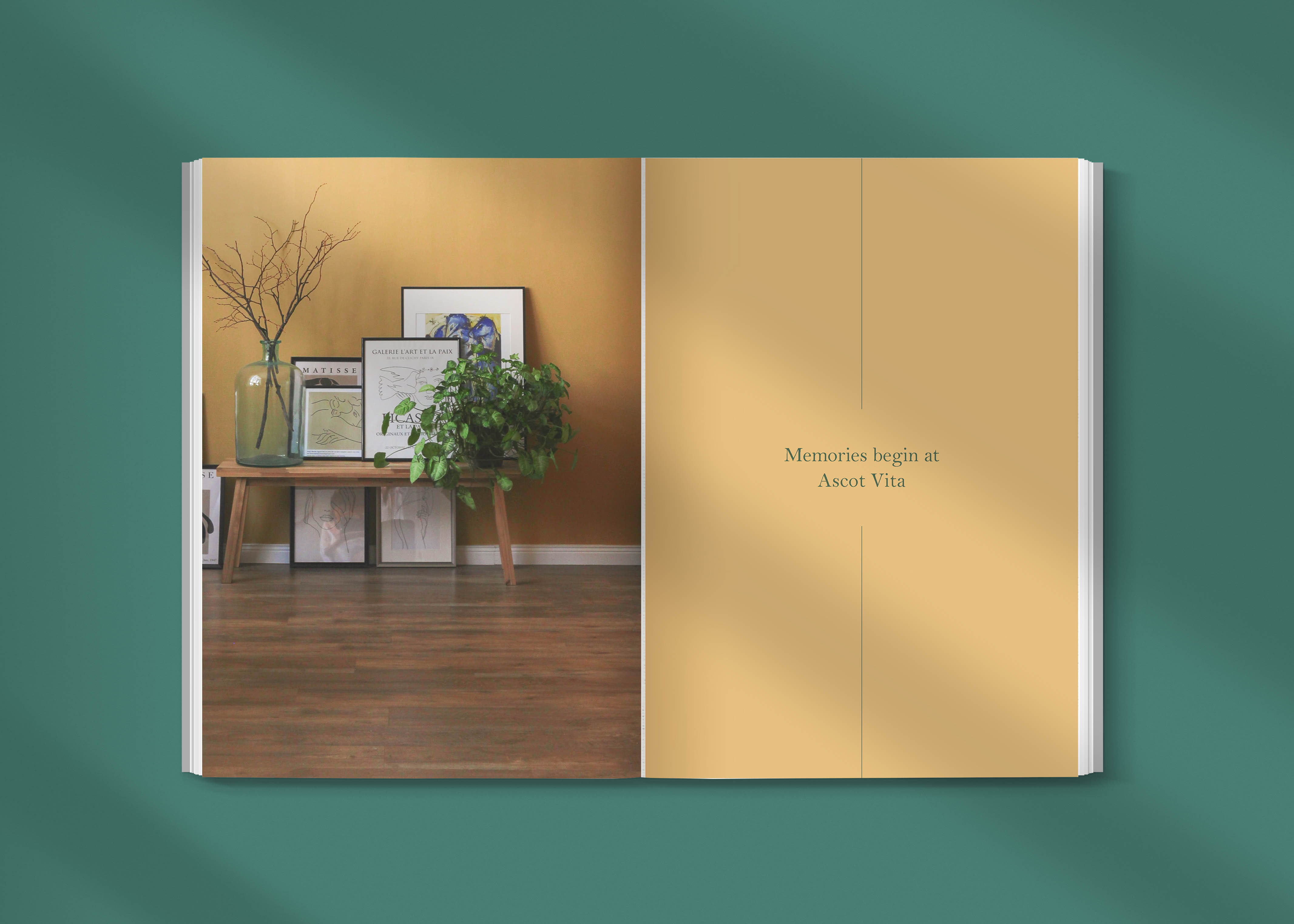
Caffeine-powered
User-led
I’m a Product Design Strategist and Systems Expert, passionate about human-centred design. Solving complex problems and turning goals into intuitive solutions is my bread and butter.
I craft scalable, multi-brand systems that work seamlessly across web viewports, mobile apps, SaaS platforms, and extensions like POS systems—keeping everything interconnected.
Fueled by coffee and curiosity, I apply design thinking to navigate ambiguity and deliver end-to-end experiences, making complex things simple, with the user always in the driver’s seat


Reduce friction in critical decision moments
Highlight actions that drive user outcomes
Simplify complex tasks into effortless steps
Shape flows that nudge users toward action
High signal–to–noise
ratio
Applying established usability heuristics to guide hierarchy, feedback, and interaction patterns so users can move through the product with clarity and confidence.
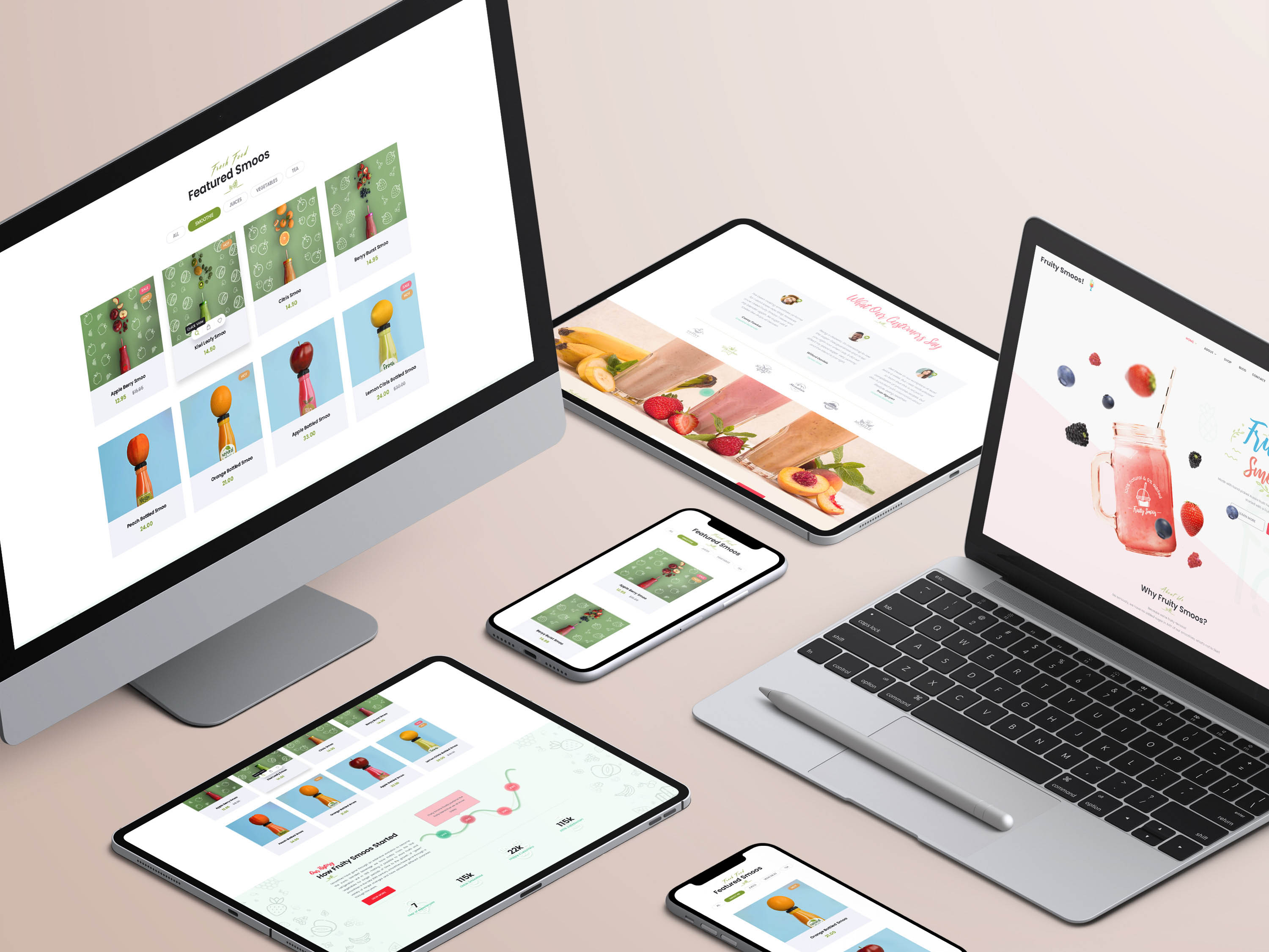
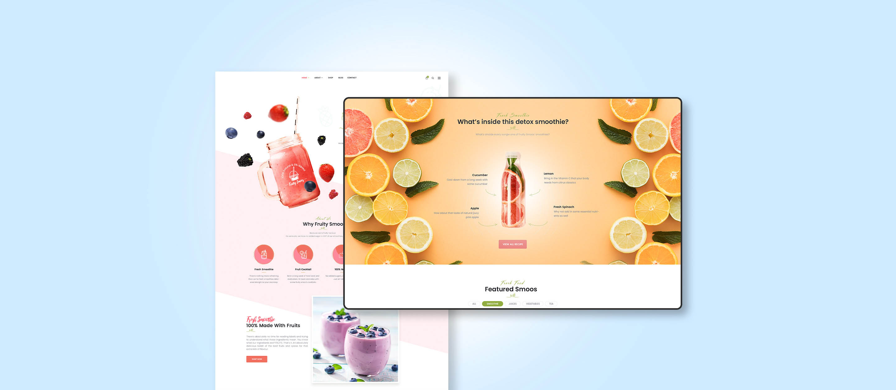
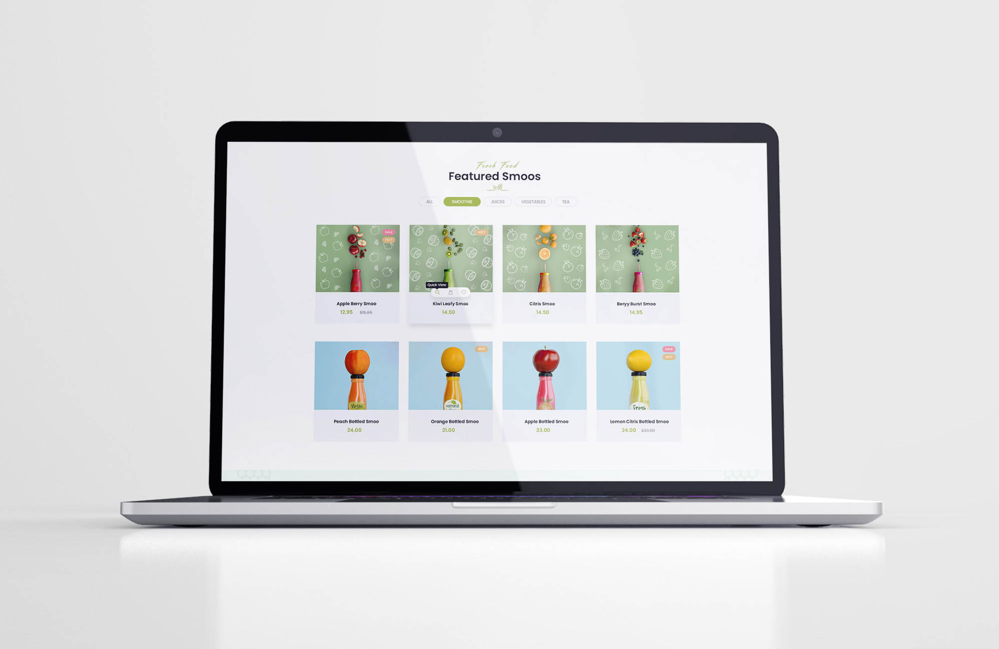
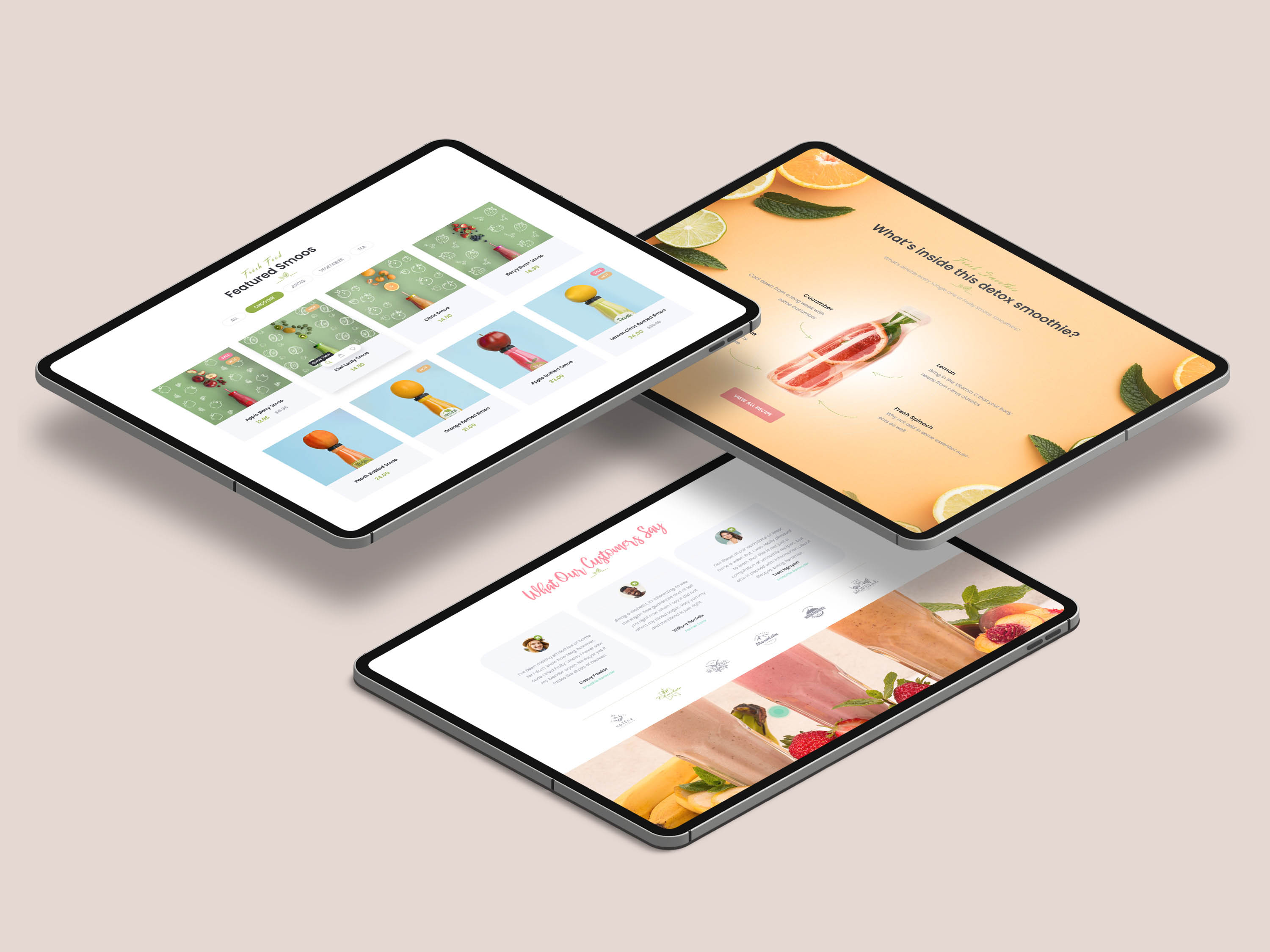
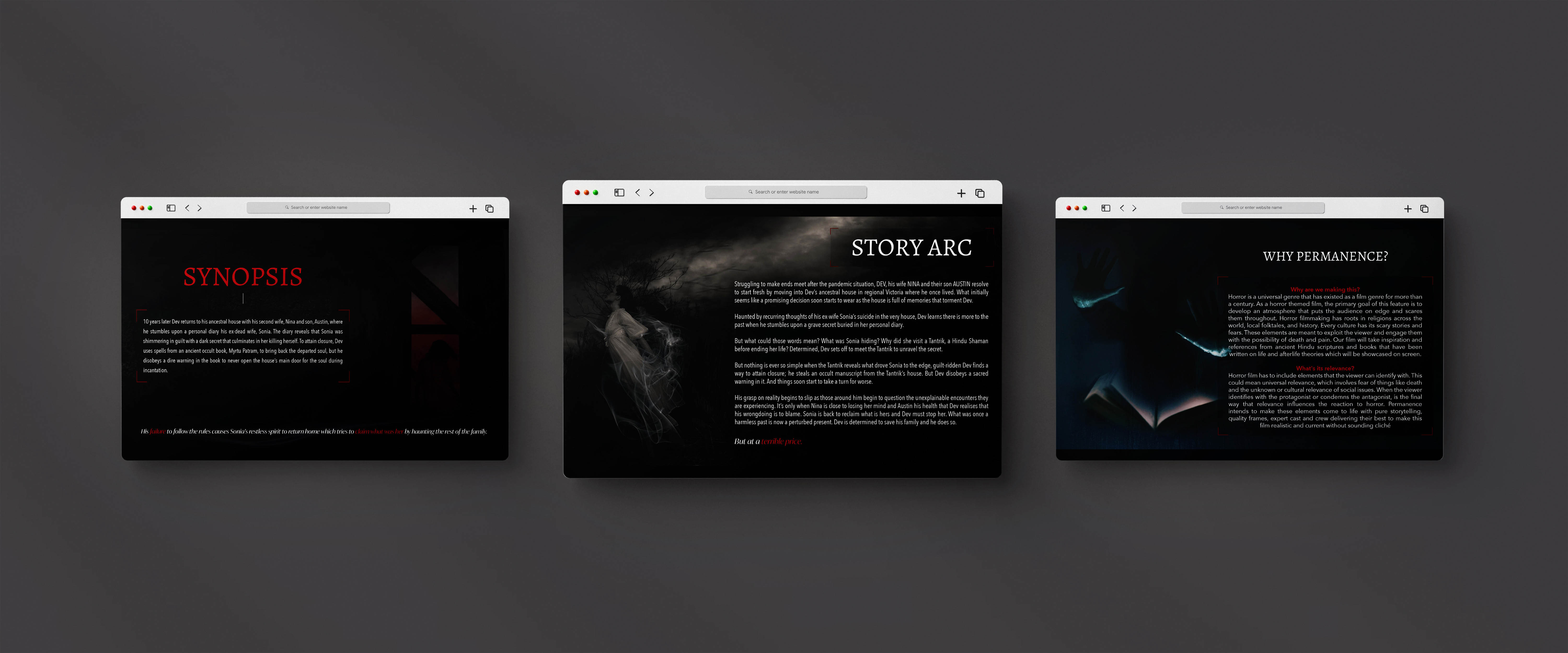
HOW I BUILT A
MULTI-BRAND
MULTI-PLATFORM
DESIGN SYSTEM
FOR ONE OF AUSTRALIA'S LARGEST FASHION RETAILER
COUNTRY ROAD
GROUP
I led the creation of a single, scalable design system for the CRG brands:
Country Road, Mimco, Witchery & Trenery
across web and apps.
Each brand retains its distinct visual identity, while the system’s atomic, object-oriented, variable-driven architecture adapts seamlessly to any platform.
Multi-brand complexity is now a cohesive, future-ready experience.


Small, flexible components adapt to brand themes in real time, showing how scale starts at the smallest building blocks.


Molecular components respond to various environments, demonstrating how structure enables variation without fragmentation.


An organism-level module adapts across brands and layouts, revealing how complex patterns stay consistent while flexing to context.


An organism-level module adapts across brands and layouts, revealing how complex patterns stay consistent while flexing to context.

Digital Experience - CONVERSION


Product Design & UX Research
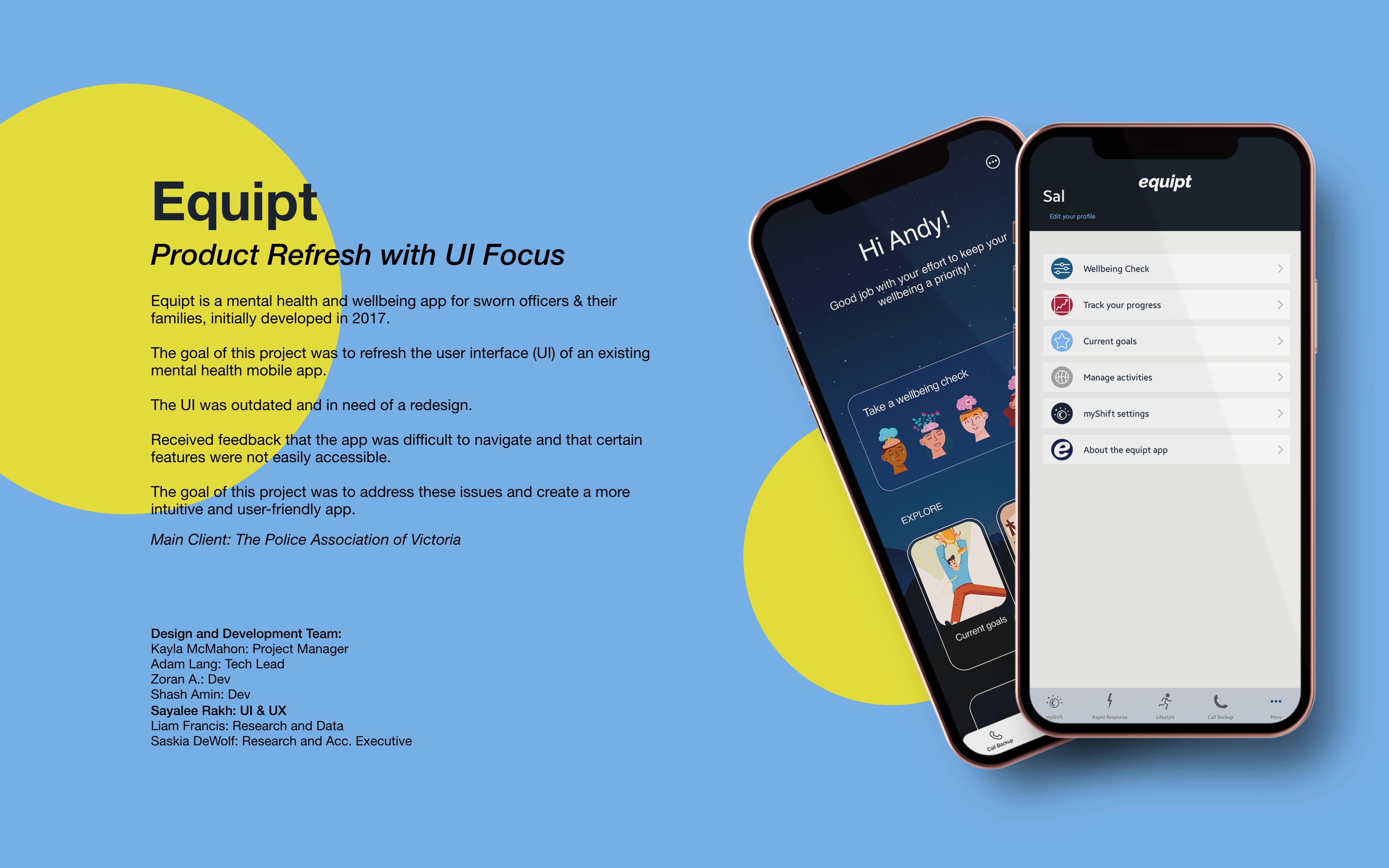


Product Design - aPP


Product Design - Saas

Product Design - App

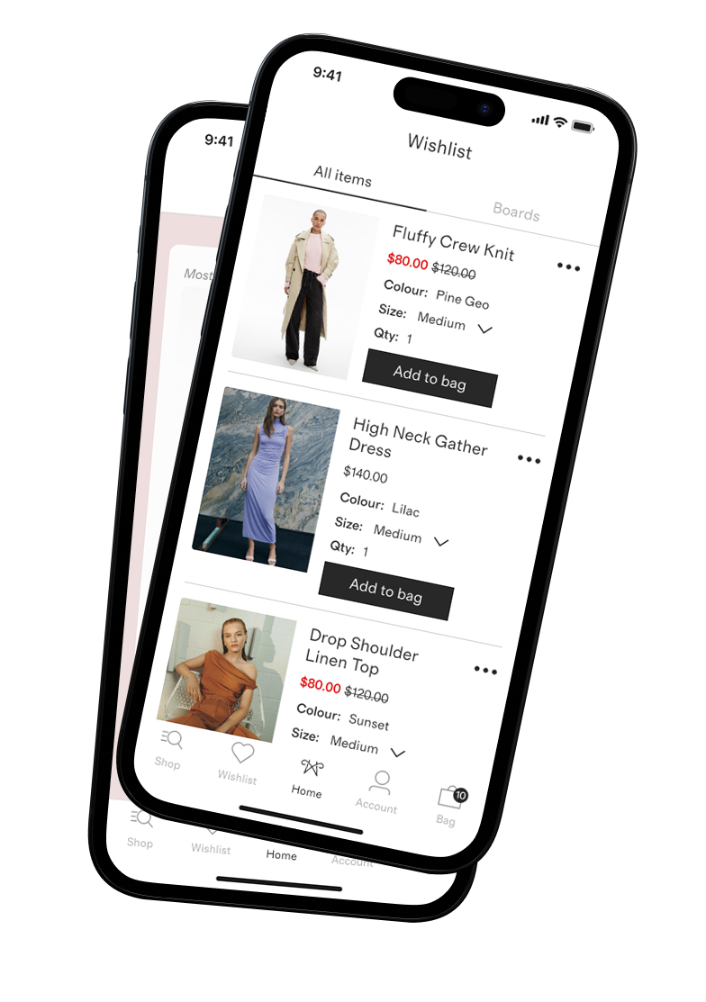
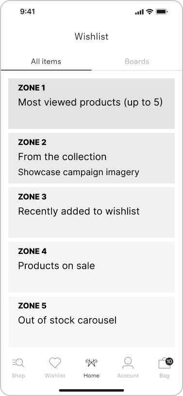
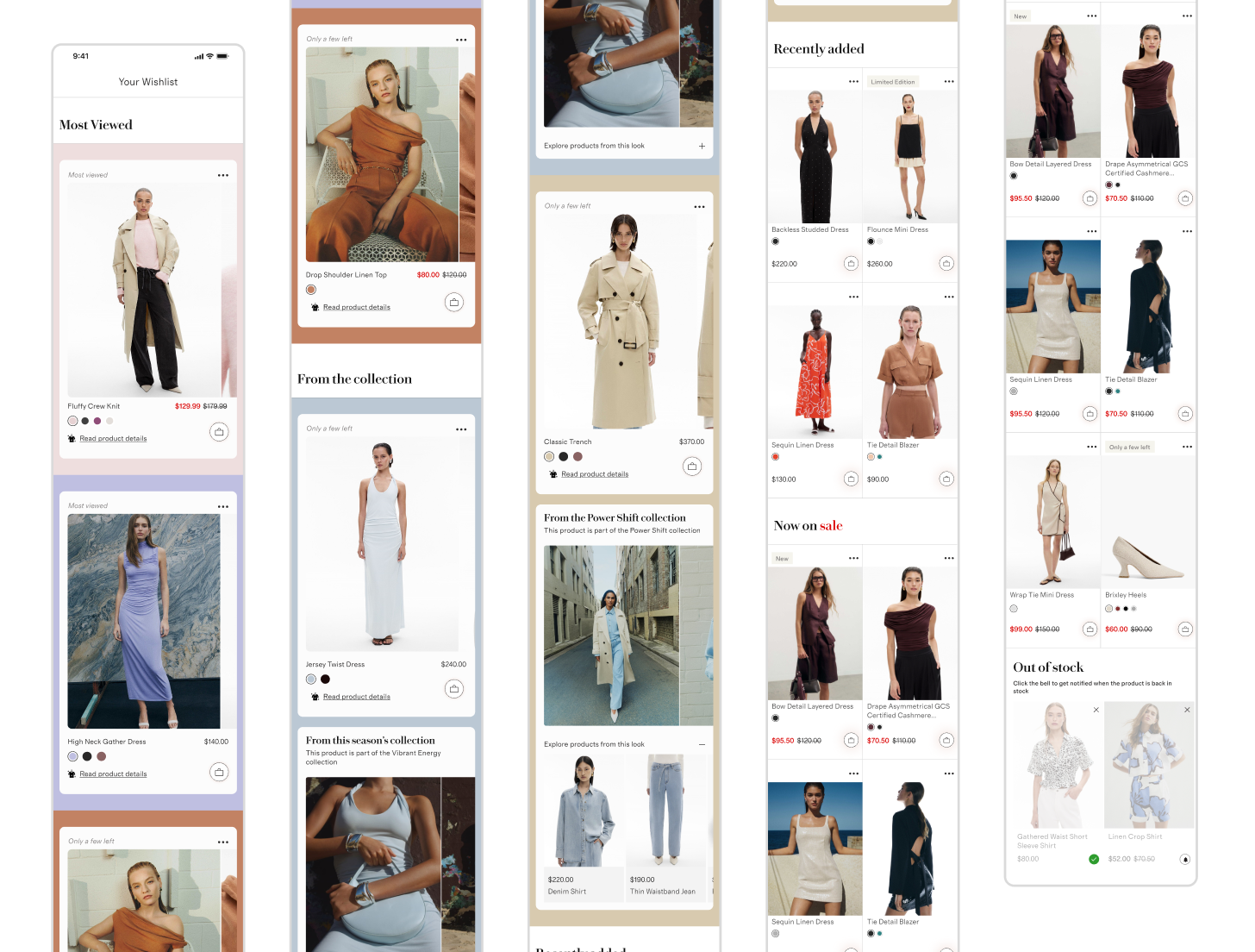
Decision Space
structuring the wishlist to support
decision-making, prioritisation, and discovery.
As the list fills up, intent becomes harder to surface and action slows.
- Visual cues help users evaluate options more confidently
- Changes in price or availability can prompt renewed interest
- Out-of-stock items often represent future intent, but add friction in the present
- Clear, scannable signals
- Immersive experience
- Lightweight comparison
- A faster path to action

Supports discovery: campaign and collection zones create context and cross-sell opportunities
Preserves intent: recently added, sale, and out of stock zones reduce cognitive load while keeping items accessible
Flexible & scalable: new zones can be introduced over time (for e.g. price watch, seasonal picks)
- Large images and immersive swatch previews encourage evaluation and comparison
- Reduces cognitive load by highlighting key decisions immediately
- Drives add to cart actions through visual clarity and immediate interaction
- Sets the tone for the wishlist as a decision-focused surface

- Carousel and accordion reveal related items for cross-sell and discovery
- Encourages engagement beyond the originally saved product
- Strengthens brand storytelling while maintaining functional navigation
- Converts inspiration into action by linking visual context to shoppable items

- Grid layout allows quick scanning and comparison across multiple items
- Encourages repeat engagement by surfacing fresh items each visit
- Supports exploratory behaviour without cluttering high-priority zones
- Reduces friction between “browsing” and “deciding”

- Grid layout encourages scanning for value opportunities
- Creates urgency subtly, nudging conversions on full-price saved items
- Drives return visits when users check for new sales
- Supports business goals (conversion, average order value) while respecting UX

- Carousel allows users to review, remove, or opt into back in stock alerts
- Preserves future intent and maintains wishlist relevance
- Encourages proactive management of saved items
- Supports retention by keeping users connected to products they care about

The system supports:
- Clear prioritisation of items that require attention
- Separation of inspiration, exploration, and maintenance states
- A balance between brand storytelling and functional decision making
This structure establishes a strong first iteration, with the flexibility to introduce new zones as signals and needs evolve over time.
As a result, the wishlist feels more intentional, more engaging, and less passive than a traditional saved-items list
Anything that makes users pause, think twice, or do extra work to get things done
Where it hits hardest:
- E-commerce: Checkout, creating accounts, finding products, handling returns
- SaaS: Signing up, onboarding, upgrading from trial, figuring out key features
Why it matters for business: Every pause or struggle risks lost sales, frustrated users, more support tickets, and lower lifetime value
The upside: Identify friction points, prefill data, simplify choices, and test faster flows, users complete tasks quicker, and conversions go up.
where are users getting stuck?
Users abandon flows when forms are long, choices are confusing, or actions take extra effort.
Smart design can remove hesitation and speed up task completion
What are some common focus ares?
Input effort, decision overload, mobile usability, and prioritising top actions.
- Reduce input effort:
Offer Apple Pay / Google Pay / PayPal, auto-fill name, email, phone, shipping & billing addresses, and defer non-essential fields until later
- Prioritise top options:
Surface the 2-3 most-used payment methods, hide low-use options behind “More,” and default choices based on device, location, or past behaviour
- Simplify decisions:
Group related fields, use progressive disclosure for optional steps, and remove redundant instructions once users gain confidence
- Design mobile-first:
Bigger tap targets, one-tap checkout where possible, inline validation to prevent errors
The more choices you give someone, the longer it takes them to decide, so displaying simpler options help users act faster.
Always show the top 3–5 options, hide the rest under ‘More.’

- Sign In: modal with email/password adds friction and interrupts the flow, violating progressive disclosure principles.
- Join Now: full form (name, email, password, phone, T&Cs) overwhelms users, creating cognitive load and drop-off risk.
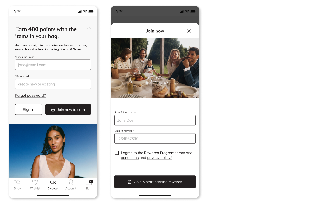
- Dynamic rewards tile shows value first (Earn 400 points with items in your bag) and direct email/password fields.
- Returning users sign in instantly; new users complete one lightweight step, applying Hick’s Law to reduce decision overload.
- Progressive disclosure reduces cognitive load, speeds completion, and highlights benefits upfront.
- Delivery options and form fields are presented with heavier visual presence and multiple detailed inputs upfront, increasing interaction effort at a critical step.
- Secondary elements and less efficient form patterns, along with interface elements that increased interaction friction, added extra steps before payment.
- Delivery choice and inputs are streamlined into predictable, easy-to-select controls and express autofill, reducing manual entry and keeping form fields to the essentials.
- The flow emphasises efficiency and continuity by prioritising critical actions and leveraging express payment methods that reduce typing and reuse captured data


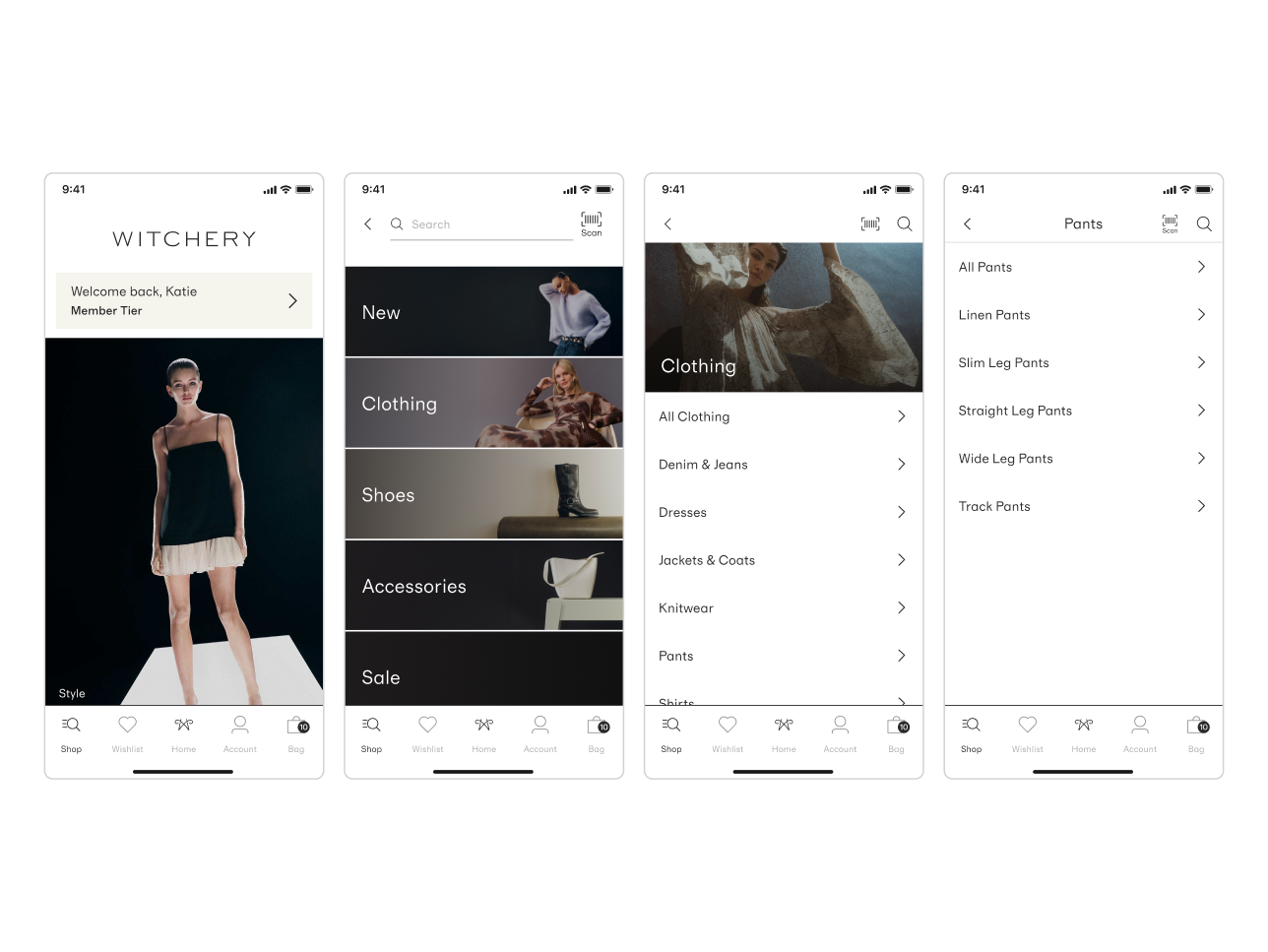
Users depend on navigation to bypass a campaign-first experience, increasing interaction cost and delaying product discovery with potential impact on conversion.
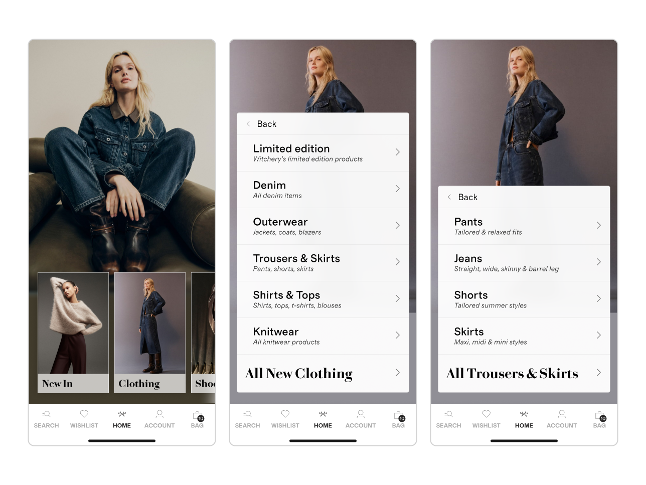
A navigation-led home surfaces categories within campaign context, reducing friction while accelerating discovery, engagement, and commercial outcomes.


< click play to watch >
Typography